Wednesday, 30 December 2015

Low Key Lighting Image Bank

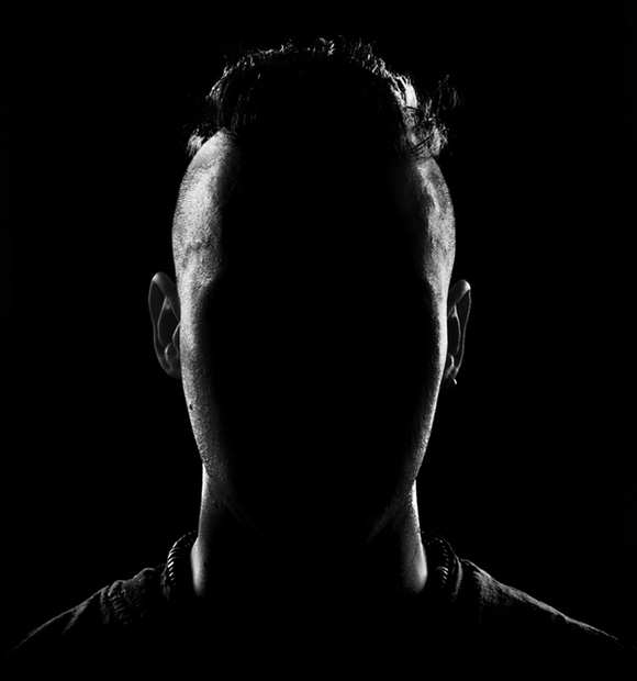
I like how in this image, the centre of the face is over powered by negative space that also makes up the background. Therefore we can only see the highlighted outline and hair line of the subject. I think this has a very strong sense of mystery as we can't see any of the facial features so we don't actually know what the subject looks like. I think this is also quite abstract as facial features are usually a very important factor in portraiture as they define the person but this picture goes against that so it is not a typical portrait.

I really like this image, epecially how the subject is looking directly to the side and that outline of her face is very clear and distinct because of the fact that it is very highlighted and it's against the negative space. I also like the back of the head fades into negative space and we can't see the rest of their head, body or hair. This gives an illusion that she is 'floating' as it appears like she is only a face. This has a mysterious connotation.

I think this picture emphasizes the idea that low key lighting has a connotation of mystery. This is because of the way half the face is negative space so we only see the right half. Also I like the way the subject is looking straight into the camera lens so when looking at the picture it seems like he is looking at us. This adds to the mystery as he has a very serious facial expression.

This picture is a bit different as some of the body is highlighted as well as the face. I like how the light has been manipulated so only certain parts of the subject are seen and the rest is negative space. This has quite an abstract look as we can only see the face and arm. I also like the angle that this was taken at, it seems from quite low down and I like the way the subject is then looking down at the lens. I think this has a connotation of power because it appears like she is above everyone else.

I like how in this picture, the contours of the face and body have been very defined by the contrast in highlights and shadows. When researching and shooting for form I found that this was an important factor that helped contribute to the emphasis of the form of the subject. Also I like the way the hair at the top shows that the light is coming from above her.

Tuesday, 15 December 2015

Henry Cartier Bressons Research

Henri Cartier Bressons Research

Henri Cartier-Bresson was born on August 22, 1908 in Chanteloup, France. A pioneer in photojournalism, Cartier-Bresson wandered around the world with his camera, becoming totally immersed in his current environment. Considered one of the major artists of the 20th century, he covered many of the world biggest events from the Spanish Civil War to the French uprisings in 1968.

Cartier-Bresson's rise as a photographer proved rapid. By the mid 1930s he'd shown his work in major exhibits in Mexico, New York, and Madrid. His images revealed the early raw possibilities of street photography and photojournalism in general.

During an exhibit of his prints in New York in 1935 Cartier-Bresson befriended another photographer, Paul Strand, who'd begun to experiment with film. Inspired by what he saw, Cartier-Bresson abandoned photography and returned to France where he took work as an assistant with French filmmaker Jean Renoir. Over the next three years, Cartier-Bresson worked on a handful of Renoir films, including his most critically acclaimed, La Règle Du Jeu (1939).

But the documentarian in Cartier-Bresson had no use or particular talent for directing feature films. Instead, he was drawn to showing real stories about real life.

His own life took a dramatic turn in 1940 following the German invasion of France. Cartier-Bresson joined the army but was soon captured by German forces and forced into prison-of-war camp for the next three years.
In 1943, after two failed attempts, Cartier-Bresson escaped for good and immediately returned to his photography and film work. He created a photo department for the resistance and following the end of the war, was commissioned by the United States to direct a documentary about the return of French prisoners.


Friday, 11 December 2015

Tone Studio Work Diary

Description of shoot:
For this shoot I was in the studio and I photographed objects and people. My aim was to achieve pictures that showed a high contrast in tones within the picture. I used the black backdrop in some pictures, this made the picture have negative space, this helped the highlighted tones of the person more highlighted and emphasised.

With this picture I liked the contrast between the negative space and the highlighted tones. To emphasis this even more when I edited this picture, I increased the contrast and adjusted the levels and curves to make the highlights lighter and the dark tones more solid.
I like how this one, in the background, it starts as negative space, then fades into a highlighted area, in the top left hand corner. I also like how her arms are very highlighted and they catch the most light. The different tones vary amongst her, as just above her arm there is a lot of dark shadows, it shows a real tonal contrast. This gives a connotation of mystery and suspense, with quite a 'horror' based atmosphere to it. I think this is because of how the negative space takes up quite a lot of the picture, it's quite overpowering, so it makes the over all picture seem very dark. I think the fact that she is covering her face, builds this connotation. 
I made this picture black and white to keep the focus on the tones on the hat. I think the most important part that shows tone in this picture is on the ribbon as you can clearly see the shine/reflection creating the lightest tones of this picture. This then gradually transitions into the darker shadows around the edges, especially focused on the left side of the hat.


Thursday, 10 December 2015

Portraiture Studio Low Key Lighting Work Diary

Description of shoot:
For this shoot I was in the studio so I could artificially manipulate and adjust the lighting to make it suitable for the effect I want for the certain picture. We used a honey comb grid in this shoot over the light. This made the light beam defined on one side of someones face. This created that dramatic lighting effect that created a high contrast in tones. These pictures usually have a mysterious connotation because not all of the face is lit and this made some of the face blend in with the negative space.

I really enjoyed doing this task as I think it is a quick and easy way to create dramatic portraits just by adjusting the lighting. I think this captures a lot of emotion and this goes hand in hand with the general idea of portraiture. Most of my shots had a dead pan expression, I think this adds to the mystery and depth of emotion to the picture.

Studio Set up:
To set up the studio to make it suitable for the shoot, I  used the plain white backdrop to create the negative space in the picture around the picture, this is to ensure all the focus is on the face. We put the honey comb over the light. I also used a plain white screen at the other side of the person, parallel to the light so that the light does't bounce back into the picture.

Below is a picture of the studio when I photographed:


Examples of Images:
Below are some pictures that I took that show the emphasis the light and the negative space has on the portrait.


I really liked how this one looks very mysterious and dramatic. I think this is because of the way I took the picture from a straight angle and she is looking straight into the camera. I liked the way half her face is dark and this blends in with the background/negative space. I think the effect this gives a serious effect as there is more darkness than light.
This image was taken from a close up angle with a landscape view. I liked how she was looking away from the camera but still with quite a serious facial expression. I like the clear definition between the highlighted side of her face (left) and the darker side (left).


Both these images have a very similar look as it has the same angle and facial expression, however one I took in landscape and one I took in portrait. I prefer the one that is portrait as I like how the studio light has effected the contours on her upper body as well as her face, eg. her collar bones.
With these pictures, I like how the highlighted areas are very highlighted making the contrast of tones very high, this makes her contours and facial features very defined and emphasised.


For all of these pictures, my camera settings were on 1/125, the ISO was 200 and the F stop was 16.

Tuesday, 8 December 2015

Irving Penn research

Irving Penn was an American photographer known for his fashion photography, portraits, and still lifes. Penn's career included work at Vogue magazine, and independent advertising work for clients including Issey Miyake and Clinique.

In his earlier work Penn was fond of using a particular device in his portrait work, replacing it with a fresh one from time to time. At one time he placed two backgrounds to form a corner into which his subject was asked to enter. It was, as Penn explains, "a means of closing people in. Some people felt secure in this spot, some felt trapped. Their reaction made them quickly available to the camera." His subjects during this 'corner period' included Noel Coward, the Duchess of Windsor, and Spencer Tracy, most of whom complied readily.
Two series of portraits are especially memorable. One was made during Christmas in Cuzco, Peru, the other in studios in London, Paris, and New York. The first, in 1948 high in the Andes, followed a fashion assignment. With a few days to spend between planes, Penn persuaded the local photographer to rent him his studio. Pushing aside the ancient studio camera and picking up his Rollei, Penn made some 200 portraits in color and in black-and-white, in a studio that had a stone floor, a painted background, a small rug, and an upholstered posing chair similar to a piano stool.

In the 1950s, Penn founded his own studio in New York and continued to develop his fashion, commercial and personal work for the rest of his life. Notably series include Flowers - produced over seven years for Vogue's Christmas editions; Dahomey - taken in 1967 when visiting the kingdom for Vogue; Still Life - modernist compositions formed of objects Penn accumulated, and Cigarettes - shot in the early 1970s and exhibited at the Museum of Modern Art, New York in his first exhibition in 1975.


Here are some examples of his portraits:

These two images are both portraits of females. He used low key light tones in both of these which are stereotypically suitable tones for female portraits as they have connotations of fun, happiness and fashion. I liked how he has used a contrast in tones for example in the top photo, the nail varnish and eye makeup creates some darker tones which add contrast to her face, just like how in the second one, the dark paint across her face adds this contrast.


These two pictures are both pictures Irving Penn took of Miles Davis. There is a clear use of high key lighting. I think this lighting technique creates a mysterious and more serious effect. Miles Davis is a trumpet player and the top picture, we can see the connotation of his facial expression and how he plays the trumpet.
I think the second picture looks especially mysterious as all of background is negative space and only his facial features are seen. And there are also some high contrasting tones, for example there is a very highlighted area like the bridge of his nose. This makes his contours stand out and look defined, this adds to the mysterious connotation.

Studio Photography Light Editing Definition Post

Snoot:
In photography, a snoot is a tube or similar object that fits over a studio light or portable flash and allows the photographer to control the direction and radius of the light beam. These may be conical, cylindrical or rectangular in shape.


Honeycomb:
The honeycomb grid is a tight structure of a similar shape to the honeycomb made by honey bees. It’s affixed to the front of a studio strobe. Or it can be fixed to an off camera flash. The light shines through the grid and creates a tight beam of light. The aim is to create a focused beam with little diffusion. It is effective in creating such a beam, but it is not as intense or focused as a snoot.


Beauty dish:
A beauty dish is a photographic lighting device that uses a parabolic reflector to distribute light towards a focal point. The light created is between that of a direct flash and a softbox, giving the image a wrapped, contrasted look, which adds a more dramatic effect.


Tuesday, 1 December 2015

Experimenting with editing

Experimenting with basic photoshop tools: 
  • curves
  • hue and saturation
  • levels

Example 1

Before                                                                  After


Processes used
Evaluation
With this portrait I took, I used multiple basic editing tools in photoshop. I think editing pictures like this is crucial as it makes a lot of difference. I think this especially applies to portraits to make the subject more interesting. Even more so with studio portraits where the background is just negative space, this is because all of the focus goes on the person in the picture. I liked my outcome and I think it looks much better than before editiong. I lowered the saturation to make the colours slightly more muted, I think this fits nicely with the denotation of the picture as we can see she is in a dead pan expression so she does't have a happy expression. Also I think muted colours have a connotation of being more serious and maybe less exciting and happy if the picture had more saturated colours. Therefore I think my editing fits with her expression to create a fitting over all theme to the picture.
I also adjusted the curves and mainly to enhance the contrast in tones. This darkened the shadows making the more obvious. In addition, to make the subject stand out more from the background, I adjusted the levels to make the background appear more white and bright. And this along with the enhanced dark shadows from the curves, I think gives the overall picture more contrasting in tones.


Example 2

Before                                                                      After


Processes used
Evaluation
In this studio head shot I took, I used these basic tools aswell. I think this example does't make as much difference between the before and after as the top example. However I still think these processes are necessary. When duplicating the layer, I sharpened her eyes. I think this made a lot of difference as it makes them stand out a lot more and makes them glisten in the picture.  I think this does make a lot of difference are eyes are a very important feature to consider when looking at portraiture. I also slightly increased the saturation and used levels and curves to enhance the shadows and tones to create more of a contrast.


Using different photoshop tools:
  • dodge
  • burn
  • white balance
Example 1 (white balance)

Before                                                                   After


 Processes used
Evaluation:
In this example I experimented with the white balance tool. I chose this picture as the background is supposed to be white but it has more of a grey like tone to it. Therefore I felt like using this tool to make the tone a closer tone to white, it would make the tones more cool rather than dull which I think worked well with this image. I also used this with the basic tools I experimented in the above examples. I think this tool is useful and I will defiantly use it again in images like this where the white areas are perhaps off-white.


Example 2 (dodge and burn)

Before                                                                   After
I personally think this image was better before I used the dodge and burn tool. This is because I think with these edits on this picture, as there is already some shadow on her face due to her arm, it looks quite artificial and unnatural with he dodge and burn.


Editing Definition Post

PPI - pixel per inch
72 PPI -the general convention used for uploading images that are viewable on screens eg. on websites
300 PPI -general convention that is suitable for printing images

White balance - The process of removing unrealistic colour casts, so that objects which appear white in person are rendered white in your photo. Proper camera white balance has to take into account the "colour temperature" of a light source, which refers to the relative warmth or coolness of white light.


Friday, 27 November 2015

Joiners Contact Sheet


Studio Portraiture Work Diary

Description of the shoot:
This shoot involved two sections. Both of which were taken in the studio. The first involved taking head shots on a coloured pictures. This was inspired by  . The idea was to focusing on the facial expressions as there is no background so all the focus is on the face and the angle from which it was shot was important. I then took some pictures that included the head and the top of the body, everything besides the legs. This looked more at the position of the person being shot.

Here is an example of a head shot:
This was one of my favourite images as I like how her hand is on her face I think it looks like quite a natural position but because it's been captured from the front it still gives a structured look.
I edited this picture in photoshop. I chose this one because I wanted to edit it so that the face and the eyes had more highlight and definition so I chose this one as I liked how her eyes were looking straight into the camera. I think these edits make her eyes look very piercing and they draw our attention towards them.

This shows the different layers I used to create the effect of the picture above. The vignette helped darken the edges so the picture seems to be getting lighter as it goes in. You can see here that I also sharpened a layer and I did her eyes which helped to define them even further.

Picture I liked:
F/9    ISO 200    SS 1/125
Over all my pictures I think this was my favourite as I think her eyes strand out a lot. I also like how her expression is in dead pan however there is still so much emotion to this picture. I also like the contrasting tones as there is the negative space in the background and theres highlighted tones on the left side of her face and there's also some darker shadows to create a nice contrast. I made it black and white to create a dismal mood to match her dead pan expression. The fact that she is playing with her scarf in this picture also build this connotation.

This shows what layers I did to edit the picture above.


Progression and image I disliked:
I didn't really like this picture as I think I took it from too far away so I got too much negative background space above her head which isn't necessary and also the negative space cuts out at the top and it is slightly slanted so it makes the whole image look quite distorted rather than straight and well measured like this head shot  was supposed to be. Also her face is not entirely in focus which disregards the point of portraiture as her face is the most important part so if it is slightly blurred like this, the image lacks definition and depth as there is no foreground so she is not separated from the background.

If I had a chance to re do this shoot I would try to experiment with angles more to get more of a variety, especially in my head shot pictures. I think this is important as different angles can completely change the perspective of the whole picture so by having more of a range of angles my pictures may be more interesting.

Images from the internet:
This image is a good example of very a head shot portrait that has very piercing and defined eyes. This is the kind of thing I was trying to create by editing and sharpening the eyes in some of my head shot pictures. 


Portraiture Straight Images

I took this picture from a front angle. I like how she is looking straight into the camera and she is the centre of the picture. I think this makes her look quite powerful and there is a connotation of strength as when looking at this picture it seems like she is looking straight into the person looking at the picture.

The denotation of this picture is that she is standing on the top of the staircase against a brick wall. The camera angle I took this from was from quite low down compared to her as she is quite high up. She is looking into the distance, passed the camera lens. I like how this angle makes her look quite elevated. In addition I think this has a connotation of authority and power as she also has quite a serious expression which supports this.

This pictures denotation is that she is sitting in the middle of a school canteen at a table which chairs and a bottle of drink in the background, she is also eating a lolly sweet. This picture was inspired by Alec Soth as his pictures contain important backgrounds that contexualise the picture and it all fits together well. Therefore I quite like how she fits in with her background. I also like the narrow depth of field as this put a lot of emphasis on her being the focus point. This was taken from a slightly side angle and it is at the same height that she is at.

This picture has a simple denotation of her standing against a brick wall with quite a dead pan expression. I think this has quite connotation of seriousness and it seems like there is some pain and deep thoughts behind this picture. I think this is a result of her expression but also that she is just standing still with her hands naturally by her side. 

This picture has a denotation of her sitting on a wooden bench in the middle of some grass and she is laughing. I liked this picture because it shows a natural expression, and because it's her laughing and looking happy I think it creates quite a positive denotation. To support this connotation, when editing this picture, I increased the saturation and the brightness to add to this positive connotation. I quite like the effect of the bright green grass as I think it looks quite vibrant.