Showing posts with label work diary. Show all posts

Tuesday, 26 April 2016

Location/Landscape Work Diary

Description of Shoot:
In this shoot, we went on a class trip to Trafalgar Square to take pictures. I focused on taking location and landscape pictures.

Best Images: 
 I liked this picture because of how it is quite rustic and quite abandoned looking, like it's not taken good care of. As well as being an amazing city filled with very famous landmarks, there are also some places in London that are not so looked after, places that represent the real London. I have edited this picture to put a cooling filter on it, and to make the tones stand out more.


F/4.2    ISO 400    SS 1/30


I like this one because it shows the typical London that we all know; the London we all expect it to be.
I like the way some buildings are in the background, as a silhouette, like Big Ben Tower. I think this adds depth to the picture, as we see how the street goes really far back. In addition I really like all of the lights that create a real atmosphere of city night life. I also think this adds a lot of business to the picture, there is a lot going on. I also like the taxi in the picture and how I managed to get it in the picture when it was moving, this must have been a result of the shutter speed allowing the movement to be captured while still recognising it is a car, rather than just a blur.


F/5.6    ISO 1400    SS 1/15


Progression:
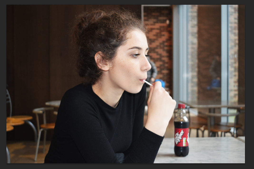
This shows a location portrait that I tried however I don't like how it turned out because of the flash, it made the model stand out too much because of the way it illuminated her but the background remains dark. I also don't really like the position she is in.

To improve this shoot I could have taken more location portraits but with no flash and I could have her look at the camera instead of looking away.

Tuesday, 19 January 2016

4th Plinth / Composition Work Diary

Description of shoot:
In this shoot, we used our own pictures to create a 4th plinth photo. I used a picture that I took from my landscape shoot as the background. The object I used to place onto the landscape was a marble ring holder. I took the pictures of the object in a studio to ensure lighting was efficient for this task. My idea was to have a landscape with a contrasting object placed onto it. This shows an abstract and unrealistic portrayal. This idea was inspired by Storm Thorgerson, in how it's placing random objects into a location to produce an abstract situation in the picture.

Editing:

 To create the objects that would be placed onto the background, I used two pictures that I took both with the hand placed in slightly different places to create a variation in my picture. I used the quick selection tool in photoshop to highlight the hand and then I deleted the background and copy and pasted them onto the background picture. I found this quite quick and easy to complete, this may have been because the hand didn't have any very small details, this made it easy to see the outline and therefore easy to select.

Final Outcome:
I made my background picture slightly darker by editing the levels and curves in photoshop. I did this to emphasis the dark tones, this made the white hands stand out more against the dark background, I think this also made the picture more abstract as the hands are more defined. 

I added three different versions of the hand onto the image as I wanted my final outcome to seem like the hands were an abstract portrayal of sculptures that have been placed there. I made them three different sizes and moved them on the photo so they seemed more randomly placed. 

I think my outcome was more dark and mysterious because of the dark background, than Storm's work. His work has a more happy and joyful atmosphere because of the backgrounds he uses and colours.

Progression:
I think next time I take a 4th plinth picture, I will use an object that relates to the picture a bit more, so there is a relationship between the object and background. In addition, I will focus on making the lighting of the objects. This is to make the lighting more realistic and more fitting with the background. This would make the objects look more like they belong to the picture and the picture would look more like an entirety.


Thursday, 14 January 2016

Landscape Work Diary

Description of shoot:
After researching landscape photography and landscape photographers, I went out and captured my own landscape pictures. I was very interested in Rut Blees Luxemburg's work after researching her. So within this shoot I tried to work in her style. I used a tripod in order to keep the pictures steady, this is because of the camera settings. In order to maintain in the style of Luxemburg, I mainly took pictures of landscapes that were man made / artificial as a pose to natural landscapes and horizons.  In this sense, I focused on buildings, construction scenery, and car parks. I found that a main factor of her work that stood out to me, was how it seems to represent urban city life. This is a sense that I have tried to re create in this shoot.

Editing:
In order to further work in the style of Luxemburg, I edited my pictures in photoshop and tried to make them similar to the effects that her pictures have. I think her style is very clear and defined as most of her pictures follow this particular style which makes her work very recognisable and memorable. I also found that this made it easier for me to work in her style. I made most of my pictures underexposed to she the darkness and has a connotation of night life. I also manipulated the colours in the pictures by making the yellows and oranges stand out more so than the other colours to emphasise the warm undertones in the pictures. I also edited the levels in the pictures to make the dark tones and shadows even more dark to create that tonal contrast.

Examples and picture I liked:
The pictures below show two examples of pictures I captured and edited. It also shows screenshots of the processes I manipulated the pictures with in photoshop.


The picture above is my favourite picture that I took in this shoot. It is also the one that I think most represents Luxemberg's work. I was inspired by the image to the right which is one of her pictures. I have used a similar sort of landscape through the use of an inside staircase in an urban and rustic looking setting. The most important factor of editing this picture was creating the darkness of the shadows to create a tonal contrast but also to manipulate the colour balance in this picture. I focused on bringing out the oranges and yellows and I put a slight orange based filter on there picture.


Progression:
In order to improve the quality of this shoot, next time, I will try and get more of a variety. I can do this by looking at natural landscapes and scenery as well as man made landscapes e.g. buildings. This way I can explore all different types of landscapes to get a bigger range of images. I think the best way to achieve this is to go out to all sorts of different places and take pictures instead of keeping to the same places.
Here is a landscape picture from the internet. This is the type of image that I would aspire to get if I could re do this shoot. I think these are the type of landscapes I am most interested in as I am not really interested in very colourful and bright natural landscapes, I am much more interested in simplistic and minimalistic landscapes that have dark tonal features and muted colours.


Monday, 11 January 2016

Experimenting with Composite / 4th Plinth Work Diary

Description:
To further explore the idea of manipulated images I used photos from the internet and used photoshop to place an object onto another picture. This is a form of image manipulation. I did this by first choosing an object, then in photoshop I used the quick selection tool to highlight the object to separate it from the background, then delete everything that's not selected (the background). Then I opened the background in a separate photoshop file and copied the original picture onto the new picture and edit it in terms of size and position to place it where I wanted it on the picture.


Example one:

When being introduced to this technique, I wanted to create a picture that all made sense and linked together or looked right, rather than just a random object. In this example I have placed a 'stop and think' sign onto a picture of silhouette seemingly attacking an adolescent. I did this to create the idea that people don't often think about the consequences and impact that their words can have on another being. I wanted this to have quite a serious and meaningful connotation to it.


Example one:


With this example, I placed a small picture of earth onto a picture of a girl looking to the side. I placed the earth in that certain place to make it look like the girl is looking at it. I quite like how the earth is on a canvas of just back negative space, I think this makes it look like it belongs as that is how we know earth to look from space. This makes quite an abstract picture as it making the whole world seem smaller than a person. I also like how the picture is in black and white but the picture of earth is in colour. I think this makes the world stand out.


Friday, 11 December 2015

Tone Studio Work Diary

Description of shoot:
For this shoot I was in the studio and I photographed objects and people. My aim was to achieve pictures that showed a high contrast in tones within the picture. I used the black backdrop in some pictures, this made the picture have negative space, this helped the highlighted tones of the person more highlighted and emphasised.

With this picture I liked the contrast between the negative space and the highlighted tones. To emphasis this even more when I edited this picture, I increased the contrast and adjusted the levels and curves to make the highlights lighter and the dark tones more solid.
I like how this one, in the background, it starts as negative space, then fades into a highlighted area, in the top left hand corner. I also like how her arms are very highlighted and they catch the most light. The different tones vary amongst her, as just above her arm there is a lot of dark shadows, it shows a real tonal contrast. This gives a connotation of mystery and suspense, with quite a 'horror' based atmosphere to it. I think this is because of how the negative space takes up quite a lot of the picture, it's quite overpowering, so it makes the over all picture seem very dark. I think the fact that she is covering her face, builds this connotation. 
I made this picture black and white to keep the focus on the tones on the hat. I think the most important part that shows tone in this picture is on the ribbon as you can clearly see the shine/reflection creating the lightest tones of this picture. This then gradually transitions into the darker shadows around the edges, especially focused on the left side of the hat.


Thursday, 10 December 2015

Portraiture Studio Low Key Lighting Work Diary

Description of shoot:
For this shoot I was in the studio so I could artificially manipulate and adjust the lighting to make it suitable for the effect I want for the certain picture. We used a honey comb grid in this shoot over the light. This made the light beam defined on one side of someones face. This created that dramatic lighting effect that created a high contrast in tones. These pictures usually have a mysterious connotation because not all of the face is lit and this made some of the face blend in with the negative space.

I really enjoyed doing this task as I think it is a quick and easy way to create dramatic portraits just by adjusting the lighting. I think this captures a lot of emotion and this goes hand in hand with the general idea of portraiture. Most of my shots had a dead pan expression, I think this adds to the mystery and depth of emotion to the picture.

Studio Set up:
To set up the studio to make it suitable for the shoot, I  used the plain white backdrop to create the negative space in the picture around the picture, this is to ensure all the focus is on the face. We put the honey comb over the light. I also used a plain white screen at the other side of the person, parallel to the light so that the light does't bounce back into the picture.

Below is a picture of the studio when I photographed:


Examples of Images:
Below are some pictures that I took that show the emphasis the light and the negative space has on the portrait.


I really liked how this one looks very mysterious and dramatic. I think this is because of the way I took the picture from a straight angle and she is looking straight into the camera. I liked the way half her face is dark and this blends in with the background/negative space. I think the effect this gives a serious effect as there is more darkness than light.
This image was taken from a close up angle with a landscape view. I liked how she was looking away from the camera but still with quite a serious facial expression. I like the clear definition between the highlighted side of her face (left) and the darker side (left).


Both these images have a very similar look as it has the same angle and facial expression, however one I took in landscape and one I took in portrait. I prefer the one that is portrait as I like how the studio light has effected the contours on her upper body as well as her face, eg. her collar bones.
With these pictures, I like how the highlighted areas are very highlighted making the contrast of tones very high, this makes her contours and facial features very defined and emphasised.


For all of these pictures, my camera settings were on 1/125, the ISO was 200 and the F stop was 16.

Friday, 27 November 2015

Studio Portraiture Work Diary

Description of the shoot:
This shoot involved two sections. Both of which were taken in the studio. The first involved taking head shots on a coloured pictures. This was inspired by  . The idea was to focusing on the facial expressions as there is no background so all the focus is on the face and the angle from which it was shot was important. I then took some pictures that included the head and the top of the body, everything besides the legs. This looked more at the position of the person being shot.

Here is an example of a head shot:
This was one of my favourite images as I like how her hand is on her face I think it looks like quite a natural position but because it's been captured from the front it still gives a structured look.
I edited this picture in photoshop. I chose this one because I wanted to edit it so that the face and the eyes had more highlight and definition so I chose this one as I liked how her eyes were looking straight into the camera. I think these edits make her eyes look very piercing and they draw our attention towards them.

This shows the different layers I used to create the effect of the picture above. The vignette helped darken the edges so the picture seems to be getting lighter as it goes in. You can see here that I also sharpened a layer and I did her eyes which helped to define them even further.

Picture I liked:
F/9    ISO 200    SS 1/125
Over all my pictures I think this was my favourite as I think her eyes strand out a lot. I also like how her expression is in dead pan however there is still so much emotion to this picture. I also like the contrasting tones as there is the negative space in the background and theres highlighted tones on the left side of her face and there's also some darker shadows to create a nice contrast. I made it black and white to create a dismal mood to match her dead pan expression. The fact that she is playing with her scarf in this picture also build this connotation.

This shows what layers I did to edit the picture above.


Progression and image I disliked:
I didn't really like this picture as I think I took it from too far away so I got too much negative background space above her head which isn't necessary and also the negative space cuts out at the top and it is slightly slanted so it makes the whole image look quite distorted rather than straight and well measured like this head shot  was supposed to be. Also her face is not entirely in focus which disregards the point of portraiture as her face is the most important part so if it is slightly blurred like this, the image lacks definition and depth as there is no foreground so she is not separated from the background.

If I had a chance to re do this shoot I would try to experiment with angles more to get more of a variety, especially in my head shot pictures. I think this is important as different angles can completely change the perspective of the whole picture so by having more of a range of angles my pictures may be more interesting.

Images from the internet:
This image is a good example of very a head shot portrait that has very piercing and defined eyes. This is the kind of thing I was trying to create by editing and sharpening the eyes in some of my head shot pictures. 


Thursday, 26 November 2015

Portraiture location work diary

Description of shoot:
For this shoot I mainly used an F stop of 8.  This was to get a shallow depth of field which helped create the effect of putting more emphasis on the face of the model which was naturally, the focus. I took photos mainly outside in natural looking locations. I also took some inside certain settings.

I think this worked quite well in some of my pictures as the background got noticeably more blurred then the person. Below is an image I took that I think shows this well:

F stop: 4.2
Shutter speed: 1/60
ISO: 1000
I think her face here is very defined and emphasised as standing out and being separate from the background setting. You can tell that the background is slightly blurred and out of focus. This photo was taken in F 4.2. This is therefore showing a shallow depth of field as the foreground is in focus but the background is slightly blurred.

Image I liked and editing process:
Below is my favourite picture that I took. I really like how she is in a dead pan view and she is looking straight into the camera. I think this draws our attention straight onto her. I also like how she is placed in the background of trees and branches, I think this makes a nice effect. I used multiple processes on photoshop to edit the levels and curves of the picture.
This is the original picture. I took it in F stop 22. This made the whole image in focus and there was no focus point. I did this because I quite liked the effect that the trees in the picture. To put more emphasis on her face, I did the vignette which I have explained below. 

This picture shows a screenshot from photoshop with includes all the different layers which include the different effects and edits I put on the picture. I slightly sharpened a copy of the layer and I sharpened the eyes. This was because I think the eyes are a crucial factor of portraiture as they draw a lot of attention and they capture our attention aswell. So especially considering this picture is in dead pan and she is looking straight at the picture, I felt it was important to focus her eyes to draw in even more definition and emphasis.

This is a screenshot of the effects that these layers have put on the picture.

To draw even more definition to her face I added a vignette process on the picture which darkened the edges of the picture so in this case I darkened the whole image using the curves tool. I then highlighted her face by applying the vignette only to her face. This made her fact seem very defined as it made it stand out more which I think is important to separate her from her background as this is portraiture.
This is the final outcome. 

Progression and image I disliked:
I didn't like this picture as the focus wrong as it was on the background instead of on her face. I think this doesn't work, especially in portraiture as the face is the most important part and she her face isn't defined or emphasised. Also the flash was on and I think this made her face too highlighted considering she wasn't in focus.

If I had a chance to improve this shoot I would vary my use of backgrounds more to get some interesting and unique settings. I think even though I did get a variety of backgrounds, some of them are quite similar or have similar ideas.

Inspiring images from the internet:
This image is from Alec Soth and I think it is a good example of a portrait picture that is in dead pan and has a vignette on it to make the face more highlighted to capture our attention. This was the same idea that I had in my black and white edited picture above.


Wednesday, 18 November 2015

Movement work diary

Description of the shoot:
For this shoot I focused on shooting movements made be people as I preferred these images. I did a lot of these images in the studio. I varied the shutter speed through out this shoot to get shots where you  could see different frames of an action in one picture. I also used a tripod in a lot of my images to ensure the camera was still so when I took the picture, the parts that weren't moving, would be clear and focused. I found my faveourite images were these ones with someone being still but doing one small action as that would be the form of movement in the picture. I also got some pictures were the person was moving her whole body and none of her was in focus. I think that gives a very different effect and also slightly distorts the form of the model. Another thing I tried was using a torch in the studio and turning the studio lights out to create a light path by moving the torch around. To do this efectivly I had a really slow shutter speed of about 4 seconds.


Image I liked:
SS 2.0   ISO 200   F/18
I liked how this image shows the movement of the hair, arms and her head. I particularly liked how we can slightly see her face where she was looking straight ahead at the ceiling but then we can also see her face where she moved to look at the camera. We can also see the movement of her hair where she has dropped it. I think how sharp her eyes look in this has a deep emotion to it and adds this emotion to the overall picture. The long exposure allowed this movement to be captures, in a way where we can see the different places where her hands, hair, and head have been.


Progression and image I disliked:


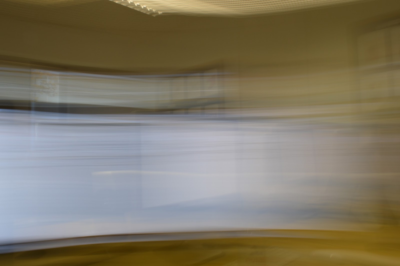
I didn't like this picture as the blur is to much and to overwhelming that there is no other substance in the picture as nothing can actually be seen in the picture. I think whilst this does show a movement as we can see the motion, it doesn't show what the movement is of and I think this makes quite a rigid and bland picture with no emotion or feeling to it. 
If I had a chance to re do this shoot, to improve it I would look more into movements of substances like cars and water and how wind moves through leaves and hair. I focused to much on movement of people and the capturing their actions to see the different frames.


Images from the internet:

I liked how this is quite a simple idea as it is just showing the movement ripples in water but when taken from this close up I think it makes a really interesting picture as we never normally see water like this for a very long time so to be able to see it in a picture means we can really see all the detailes that we would normally miss. I could easily re make a picture like this by dropping something small in water for example.


Progression:
If I could re do this shoot I would try and get more images like this as they show movement in urban everyday scenery and I did not get pictures like this. This is because movement in people, it is quite limited to how far I can take that. Also it is difficult to capture a good meaning with people.


Tuesday, 17 November 2015

Joiners Work Diary

Description of the shoot:
After learning what joiners were and how to construct them, I photographed a model form lots of different angles and different perspectives. I made sure I got some from quite far away but some from close up so I could get a variety of perspectives in the end result. I also wanted one picture that was from a straight angle where you could see the whole face to use as a 'starting point' for when I was to construct the joiner.

Final outcome:
This was my end result of my portrait joiner. The main idea I wanted to use was the middle of the picture would be the model looking to the front then on both sides the focus of the model gradually travelling to the sides. Within this I think I have a good variety of far away and close pictures. I had to crop some of the pictures to make each one sort of link together. I did this so all the individual pictures didn't look to random which make the whole thing quite confusing and disjointed.

This is the individual picture that I used as my starting point for my joiner. I thought it worked well as this as her whole face is in it so I could then work around it. Also I think it had a nice effect as this was in the very centre of the picture.


Images from the internet:
This was the picture that is also included in my joiners image bank, that inspired me to produce the type of joiner that I did. This is because I like how in this picture the middle was a front view of the girl and then either side is the view of the girl turning inwards, whereas mine is just turning outwards instead.


Progression:
If I had a chance to re do this shoot, I would probably also try and consider the body of the model more as I only shot the face and hair. If I shot from further away I could have manipulated the body shape and form to create a potentially quite interesting picture.


Thursday, 12 November 2015

Depth Work Diary

To apply my knowledge of depth to taking some example photos, I used the same model who held out different objects and I shifted the focus and changed the apeture and F stop to make it suitable for the picture to get the right exposure. I did this for shallow and wide depth of field.

Shallow depth of field:

I liked this image as it is a very clear example of shallow depth of field. This is as the focus is only on the shoe and the model in the background is blurred, this emphasises the definition of the shoe. To take this I had an F stop of 5.6 to create the blurred background. I had the shutter speed in 1/125 and to help get the perfect exposure on the image I put my camera on manual mode.


The two images above both have the same shutter speed and F stop as the first picture however I shifted the focus to be on the model rather than the camera. I think the first one didn't work so well as the models face is not entirely in the shot as it's covered a lot by the camera she is holding. I think this makes the difference in focus a lot less obvious this could make it more difficult to differentiate the layers in the picture.
I really liked the second picture as  the whole of her face can be seen this makes it easy to make her the focus of the picture. The camera is slightly blurred as it isn't in focus. I liked how sharp her eyes are as she is looking directly into the camera and I think this draws even more attention to her as the focus point of the picture.

Progression

I was not to keen on this picture as it shows no focus as all of the picture is blurred. I think this makes the picture lack any sort of depth and it means there is no focus point. Therefore the whole image is quite bland and seems as if theres not much to it. To improve the quality of this shoot I would have made sure I had a focus point to all my images to show the shallow depth of field.


Wide Depth of field:

To show this wide depth of field I changed my camera to have a F stop of 21. This allowed the whole frame of the image to be in focus. To show this technique I shot photos of a model holding a hat to show how they are both in focus. 
I wasn't to keen on this one as I think I took the photo from to far away so it's difficult to see the effect of the wide depth of field.
I think this image worked better to show this technique as we can clearly see both the hat and face is in focus.


More Examples: 

After practising these techniques and camera settings in the studio I went outside to see the effect that background has on depth of field.

This image shows quite a wide depth of field as the background and the model is in focus.
I really liked this image as it shows a shallower depth of field as the backgound is slightly blurred but the model is in focus. I think this depth of field works best with pictures like this where there is a portrait of someone against quite a plain background. I think this is because it then draws more attention to the person and makes them stand out more.
This image shows the use of a vingette, I made this quite a strong vignette to make her face seem really illuminative.
This shows the processes that I put in the image above.
I also used a vignette on this picture. Considering its a shallow depth of field picture, I liked how the background was therefore slightly blurred so I think the vignette made her stand out from the background even more which creates a defined background and foreground.

This shows the editing processes that I put on the image above.