Wednesday, 30 September 2015

Texture Work Diary

Description of the shoot:
For this topic of texture, I found it easiest to capture the texture of surfaces from up close as a pose to landscape/far away images. This is because I found the more detail the image showed of the texture, the more obvious the texture becomes and the more it stands out. I found I could get a lot of indoor and outdoor images however I found the most variety outdoors.

Image I liked:
This image was on the top of a post box. It shows the natural decay of the surface. I like how this is quite a close view and the focus is on the center/top of the image. I also like the different colours as I think it helps create a really texturized and rough surface. I edited this picture and I liked how changing the levels made the dark undertones beneath the decay look even darker, this made the decay stand out more and contrast more.
I also liked this image and how it focuses on the rust like texture on this metal surfaces. I slightly changed the hue on this picture to make the rusted parts seem a different shade, this made them stand out from the white surface that it is on. This gives a more texturised look.

For the two images above, they have both have quite a shallow depth of field I used F stop 4. I did this to put the focus on the texturised areas to seperate it from the background.

Progression and image I disliked:
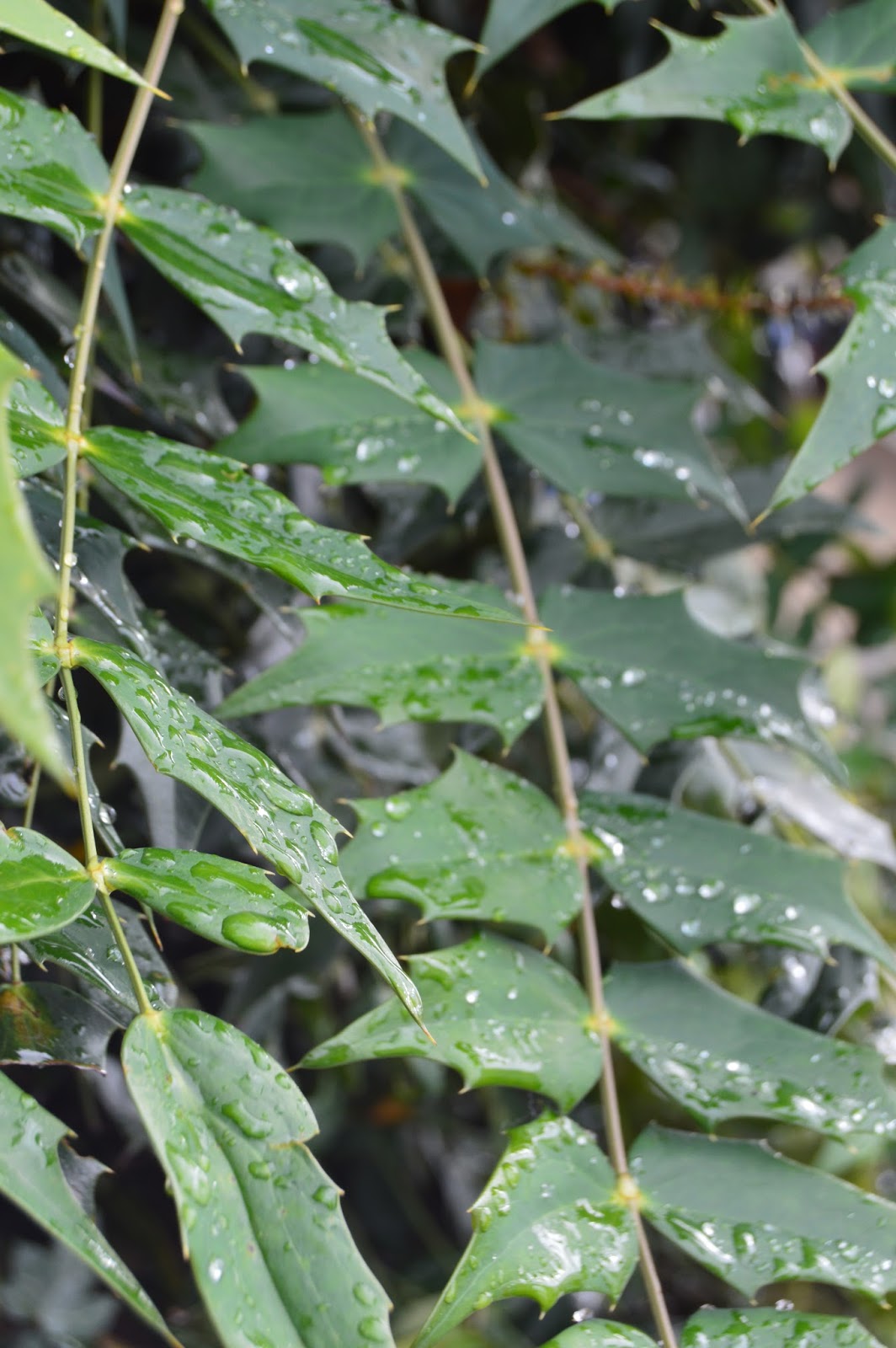
I was not to keen on this image as I think it doesn't capture texture quite so well. This could be because I took the image from quite far away, maybe it would have worked better if I took an image of the water droplets on just one leaf to emphasis the detail; making the texture more obvious and defined. I also don't really like the focus as they're is only one small section along the left edge of the image that is in proper focus and the rest of the image is quite blurred. I think this doesn't work for this image as it stops the texture of the water being as sharp.
I think to improve my shooting in this topic I think I could have got even closer close ups of some textures. This is because the more close the image is the more defined the texture becomes. I like how images like this have more intensity and detail as the texture becomes much more life like and we could imagine the feel of it more.


Images from the internet:
I really liked this image as it shows a rough texture against a smooth texture of the peeling paint. These sorts of textures can be found in all sorts of places like on walls so I could easily find them and use this as inspiration.
I liked how close this image was and if I put my camera on the right settings I could get an leaf surface from this close with this much detail.


Pattern Work Diary

Description of the shoot:
With these images I think I got a variety in the kinds of images that I took, this was because pattern can be found in a lot of different places so I actually found it quite easy to find inspiration.

I think the most difficult thing was finding patterns that are really regular and structured. I found a few examples for example the crisscross pattern on drains etc, but the majority of patterns that I captured were more uneven.


Image I liked:
This was my favourite picture that I took in this topic of a floor made up of a regular squared pattern. I like how even though the pattern is really regular and ordinary, because of the other factors in the picture, the image looks quite rough and natural. For example the dirt and rust on some of the edges of the tiles make the image quite natural looking. Also some of the tiles are slightly higher or lower than the others, creating a more uneven surface. I think these things make the image more interesting and it adds more detail and meaning to the image. I think this shows how important it is to consider the other factors of the image even when just focusing on one topic. 


Progression and image I disliked:
I did not like this image so much because while there is the individual patterns on the scarves, and also the pattern of all the scarves laid down in that regular structure, I think the image has to much going on making it difficult to see the patterns and to differentiate them. For example there are a lot of different colours and there is a lot going on in the background as I took the image from quite far away. So I think this image would have been better if I zoomed in on just the scarves.
To improve this task if I was to do it again I could have looked into patterns from afar as well as close ups. The majority of my images were from close up so if I got some from far away I could have had a bigger variety.


Images from internet:

I really like this image because even though it is of the inside of a tree which something we might usually consider to be quite simple, when taken from this angle and from this close up it really enhances the pattern. If I could re do this shoot I would try and get more photos like this as they are quite easy to do and find.

I think this image shares the same idea as the image I took that I said I liked in this work diary as it is of a regular and repeated design which is an ordinary shape (circle). 


Colour Work Diary

Description of the shoot:
For colour I got a mixture of complementary, analogous and muted colours. I found it difficult however to find saturated colour. This could be because of the locations of where I took my photos, and also because of the lighting, I took a lot of photos outside and the sun was not out for most of it so this could have made the colours appear more on the muted side rather than saturated.

I found a lot of analogous colours especially in nature with all the greens and yellows of trees and leaves. The most common complementry colours that I found were green and red.
If I was to repeat this topic I would try to get more a variety in the colours I used. I could do this by going inside places more as I got a lot of outside pictures so the colours I found were often quite similar.


Image I liked:
I edited this picture in photoshop and the most important process I put on the picture was increasing the saturation and vibrance. This made the individual colours stand out a lot more and made the over all picture seem more lively as it looked more colourful and radiant which has quite a posative connotation. I think editing the picture really made a difference as this was taken outside and the sun wasn't shining so the overall lighting was quite dull and this therefore made the colours quite muted seeming, Also because there are multiple colours in this picture, when I increased the saturation, these colours really came through a lot more becoming more solid and this also created a higher contrast beetween the seperate colours.
With this image I went through the same editing processes on photoshop to emphasis the colours more. I like the colours combinations of this picture as there are only three main colours (purple, yellow and green). I like how the background green colour makes the purple leaves stand out quite a lot as they are quite different colours. I think this emphasises the differentiation between the foreground and background quite well.


Progression and image I disliked:
I think this image could have worked well if my intention was to create a muted and dull picture. However I did not really like this picture for my intentions as I wanted the red of the berries to be more saturated making it stand out more against the green creating more of a contrast. I think this image shows how important colour saturation is because if this image had a brighter lighting and a higher saturation, it would have a much happier and joyful mood. However because the green and red are quite muted, causing quite an overall dullness in the image, it lacks that happiness and excitement making the image have quite a sad response.
Therefore to improve this topic I could have focused on brighter colours to make them seem more vibrant and accentric as I think this makes colours have more of an effect on photos and make them seem more lively. This overall adds more interest to pictures I think.

Images from the internet:
I think if I re did this shoot I could have looked at my pictures containing more bright colours like this as a lot of my pictures only focused on a few main colours at a time however I like how this one has lots of different colours that are all intertwined.
This is a good example of the type of photo I was trying to get with my photo above in my progression. This picture shows also red on green as flowers on grass instead of berries but it has the same principles. However this picture has the vibrance caused by the saturated green and red. This makes the picture more lively and happy and also makes the colours stand out more especially it makes the red flowers stand and defines them more as they are against quite a solid green background.


Line work diary

Description of the shoot:
For this topic, I felt like I could use a variety of close up images and far away landscapes as they create different effects on the image. For example leading lines was a good focus for landscapes as buildings and alleys can often take the eye to one spot. I started by focusing on man made lines for example buildings and windows but when getting further into the task I realized that lines can be found a lot in nature especially when taking a close up.

I also tried to get some distorted lines in my images. I feel like this creates a good effect especially in horizontal lines because they represent tranquility and peace so by making a distortion in the picture, it breaks the smoothness and adds interest.


Images I liked: 

With the two images above, I liked how they look quite simplistic. I edited these in photoshop to make the colours and tones more bold and solid and this added to this simplistic effect. This also increased the contrast between the dark colours and the light background. 
With the second one, I like how the negative space can either be the black or white as there is no real foreground or background but either way the lines are made up of this space. I think this gives quite an abstract effect.

Progression and image I disliked:
I wasn't to keen on this image because theres only two distinct lines. While I like how clear cut the lines are, I think the image lacks personality and emotion as there's not much substance or scenery to the image. Also the two lines are quite distorted; they are not parallel or diagonal or leading, they are placed quite randomly. Therefore I think I could have had improved results if I took more images that involved more complexity in terms of using lines, this would add more depth and emotion to the pictures, possibly making them more meaningful.

If I could repeat taking these images, to improve I would look for more curved lines as I got one image that shows this and it's one of my favorite images that I took on line as I think curved lines have a smoothing effect. I like this because I think it makes images easy going to look at which can give a tranquil effect.

Images from the internet:
This is an image I found on the internet that I think has similar principles as the image I said I liked in this work diary. This is because this also has a set of diagonal lines that lead us to a certain point. However in this picture we can see the end point whereas in my picture the lines continue throughout the whole width.
If I could re do this topic I would look more into doing a picture like this as I didn't manage to get many leading lines examples. I like how its symmetrical as well I think this has a nice and quite tranquil effect as it's all very calm and regular.


Tuesday, 29 September 2015

Form image bank

I liked this image by Bill Brandt because the form has been manipulated by use of tones and shadows. This gives the image different interpretations by different people depending on what you think of when you see it. The image captures the human condition however this diffuses into the idea of nature because of how close the picture is and the background.
This image shows a good example of the human condition. There is good use of shadows and light which create tones on the image and this makes the image appear more detailed and structured. I also like how there is two hands in the image but they're in different positions which makes them look completely different however because of our knowledge we still know they're both hands.
I really like this image because of the way the tones make the arm fade into darkness. This creates an illusion that the bottom isn't there and it fades into the background. This makes it an abstract image of something normal considered quite ordinary. So  I like how this image uses tone and form to create a more exciting and unique perspective of arms and hands.

This image shows a good example of the human condition form. The different tones on the figure and the way it's shaped gives off a quite complex effect that allows the image to be seen as other things. The tones in the image emphasis and define the dents and contours on the back of the figure. This shows how tone is important when photographing for form.
This image has a very contrasting dark shadow going through the centre. This makes the object seem complex and very shaped. Different people will see this image in different ways as it is unclear on what it is.


Form definition post

Form actual definition: 
a 3D shape. Sculpture and 3D design are about creating form. In 2D images, tone and perspective can be used to create illusion to form.

My interpretation of the definition of form:
Form looks at the shape and structure of a 3D object but form can be captured by a 2D image. Different tones in the image can be used to manipulate the look of the form. I personally like the use of form in the human condition. This is because the lighting and positioning that the person is in and the way the image is taken, can make a person or part of a person look different to how we would normally see it. This can be used to make images look more abstract and unusual. Depending on personal opinion, some people may really like this way of seeing the human form however some people may prefer seeing people as we would see them.

Wednesday, 23 September 2015

Texture Image Bank


Image result for texture in photography
This image is a close up of some rope. Because of how close the image is, we can see all the individual strands that make up the rope and by seeing all these strands it's very clear that it makes up the texture of the rope that by seeing it, we can all imagine the texture. The tones that the light and shadows make, creates an effect on the individual strands which makes the texture more distinct.
Image result for texture in photography
I like how the fact this image was taken at a close position to the ball, we can clearly see all the dirt and cracks on the dirt that emphasizes the uneven and rough texture of the surface. Although the top left edge of the ball has quite a softer and smoother texture, this could be because the focus is not on this point of the image so the picture isn't as sharp. I like this picture as the surface is very detailed and we wouldn't normally see a ball with this much detail.


Image result for texture in photography
This texture is clearly fur which a lot of people would straight away recognize when seeing this image. The individual hairs complete the texture and the way the are laying suggests a smooth fur.

This image is a close up of a drain with dry and old paint. I like this image as there are almost two textures. The texture of the actual drain which is created by the pattern on it, and the texture of the paint that's cracking and drying up.
I like how this image contains 3 different, yet similar textures of the surface of crocodiles. This texture is quite unique and it's quite recognizable as being of crocodiles however the detail of the markings and patterns that this image portrays is very sharp and distinct.

Texture Definition Post

Texture Definitions

Oxford dictionary definition:
the feel, appearance or consistency of a surface or subject

My interpretation of the definition:
The surface of either a 2D or 3D image and the different tones, dents or patterns the surface has changes its feel/look.

Pattern Image Bank

Image result for pattern in photography


This image has a seemingly continuous pattern made artificially from the wheels from bikes. I like this image because I like how the pattern travels in a direction so the eye follows that direction. I think this has a good effect on the image. 


Image result for pattern in photography
Like the picture above, this picture is an artificial pattern that travels in one direction, which leads the eye. I especially like this image because the shadows on the floor also create a pattern which makes the image more complex and interesting. 

Image result for pattern in photography
This pattern moves outwards in a spiral. I like the complexity of the pattern and how there are multiple directions to follow.

Image result for pattern in photography
I like this image because of it's detail. While there is the main pattern of the tires, the tires themselves all have an individual pattern on them. I also like how this image doesn't follow a certain path or direction, I think this creates an interesting effect.
Image result for pattern in photography
I like this image because the pattern is not very ordinary or simple and perhaps quite confusing. I think this creates an interesting and detailed effect. There are different layers to the pattern that all fit together nicely to create the overall picture.