
Friday, 27 November 2015
Studio Portraiture Work Diary
Description of the shoot:
This shoot involved two sections. Both of which were taken in the studio. The first involved taking head shots on a coloured pictures. This was inspired by . The idea was to focusing on the facial expressions as there is no background so all the focus is on the face and the angle from which it was shot was important. I then took some pictures that included the head and the top of the body, everything besides the legs. This looked more at the position of the person being shot.
Here is an example of a head shot:

This was one of my favourite images as I like how her hand is on her face I think it looks like quite a natural position but because it's been captured from the front it still gives a structured look.

I edited this picture in photoshop. I chose this one because I wanted to edit it so that the face and the eyes had more highlight and definition so I chose this one as I liked how her eyes were looking straight into the camera. I think these edits make her eyes look very piercing and they draw our attention towards them.

This shows the different layers I used to create the effect of the picture above. The vignette helped darken the edges so the picture seems to be getting lighter as it goes in. You can see here that I also sharpened a layer and I did her eyes which helped to define them even further.
Picture I liked:

F/9 ISO 200 SS 1/125
Over all my pictures I think this was my favourite as I think her eyes strand out a lot. I also like how her expression is in dead pan however there is still so much emotion to this picture. I also like the contrasting tones as there is the negative space in the background and theres highlighted tones on the left side of her face and there's also some darker shadows to create a nice contrast. I made it black and white to create a dismal mood to match her dead pan expression. The fact that she is playing with her scarf in this picture also build this connotation.

This shows what layers I did to edit the picture above.
Progression and image I disliked:

I didn't really like this picture as I think I took it from too far away so I got too much negative background space above her head which isn't necessary and also the negative space cuts out at the top and it is slightly slanted so it makes the whole image look quite distorted rather than straight and well measured like this head shot was supposed to be. Also her face is not entirely in focus which disregards the point of portraiture as her face is the most important part so if it is slightly blurred like this, the image lacks definition and depth as there is no foreground so she is not separated from the background.
If I had a chance to re do this shoot I would try to experiment with angles more to get more of a variety, especially in my head shot pictures. I think this is important as different angles can completely change the perspective of the whole picture so by having more of a range of angles my pictures may be more interesting.
Images from the internet:

This image is a good example of very a head shot portrait that has very piercing and defined eyes. This is the kind of thing I was trying to create by editing and sharpening the eyes in some of my head shot pictures.
Portraiture Straight Images

I took this picture from a front angle. I like how she is looking straight into the camera and she is the centre of the picture. I think this makes her look quite powerful and there is a connotation of strength as when looking at this picture it seems like she is looking straight into the person looking at the picture.

The denotation of this picture is that she is standing on the top of the staircase against a brick wall. The camera angle I took this from was from quite low down compared to her as she is quite high up. She is looking into the distance, passed the camera lens. I like how this angle makes her look quite elevated. In addition I think this has a connotation of authority and power as she also has quite a serious expression which supports this.

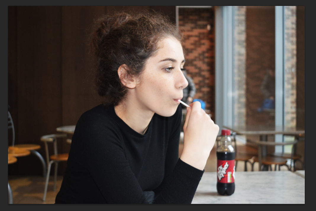
This pictures denotation is that she is sitting in the middle of a school canteen at a table which chairs and a bottle of drink in the background, she is also eating a lolly sweet. This picture was inspired by Alec Soth as his pictures contain important backgrounds that contexualise the picture and it all fits together well. Therefore I quite like how she fits in with her background. I also like the narrow depth of field as this put a lot of emphasis on her being the focus point. This was taken from a slightly side angle and it is at the same height that she is at.

This picture has a simple denotation of her standing against a brick wall with quite a dead pan expression. I think this has quite connotation of seriousness and it seems like there is some pain and deep thoughts behind this picture. I think this is a result of her expression but also that she is just standing still with her hands naturally by her side.

This picture has a denotation of her sitting on a wooden bench in the middle of some grass and she is laughing. I liked this picture because it shows a natural expression, and because it's her laughing and looking happy I think it creates quite a positive denotation. To support this connotation, when editing this picture, I increased the saturation and the brightness to add to this positive connotation. I quite like the effect of the bright green grass as I think it looks quite vibrant.
Thursday, 26 November 2015
Portraiture location work diary
Description of shoot:
For this shoot I mainly used an F stop of 8. This was to get a shallow depth of field which helped create the effect of putting more emphasis on the face of the model which was naturally, the focus. I took photos mainly outside in natural looking locations. I also took some inside certain settings.
I think this worked quite well in some of my pictures as the background got noticeably more blurred then the person. Below is an image I took that I think shows this well:
F stop: 4.2
Shutter speed: 1/60
ISO: 1000
I think her face here is very defined and emphasised as standing out and being separate from the background setting. You can tell that the background is slightly blurred and out of focus. This photo was taken in F 4.2. This is therefore showing a shallow depth of field as the foreground is in focus but the background is slightly blurred.
Image I liked and editing process:
Below is my favourite picture that I took. I really like how she is in a dead pan view and she is looking straight into the camera. I think this draws our attention straight onto her. I also like how she is placed in the background of trees and branches, I think this makes a nice effect. I used multiple processes on photoshop to edit the levels and curves of the picture.

This is the original picture. I took it in F stop 22. This made the whole image in focus and there was no focus point. I did this because I quite liked the effect that the trees in the picture. To put more emphasis on her face, I did the vignette which I have explained below.

This picture shows a screenshot from photoshop with includes all the different layers which include the different effects and edits I put on the picture. I slightly sharpened a copy of the layer and I sharpened the eyes. This was because I think the eyes are a crucial factor of portraiture as they draw a lot of attention and they capture our attention aswell. So especially considering this picture is in dead pan and she is looking straight at the picture, I felt it was important to focus her eyes to draw in even more definition and emphasis.

This is a screenshot of the effects that these layers have put on the picture.

To draw even more definition to her face I added a vignette process on the picture which darkened the edges of the picture so in this case I darkened the whole image using the curves tool. I then highlighted her face by applying the vignette only to her face. This made her fact seem very defined as it made it stand out more which I think is important to separate her from her background as this is portraiture.

This is the final outcome.
Progression and image I disliked:

I didn't like this picture as the focus wrong as it was on the background instead of on her face. I think this doesn't work, especially in portraiture as the face is the most important part and she her face isn't defined or emphasised. Also the flash was on and I think this made her face too highlighted considering she wasn't in focus.
If I had a chance to improve this shoot I would vary my use of backgrounds more to get some interesting and unique settings. I think even though I did get a variety of backgrounds, some of them are quite similar or have similar ideas.
Inspiring images from the internet:

This image is from Alec Soth and I think it is a good example of a portrait picture that is in dead pan and has a vignette on it to make the face more highlighted to capture our attention. This was the same idea that I had in my black and white edited picture above.

Wednesday, 25 November 2015

Tuesday, 24 November 2015
Portraiture Photographer Research
Alec Soth
"I fell in love with the process of taking pictures, with wandering around finding things. To me it feels like a kind of performance. The picture is a document of that performance."
Alec Soth’s work is rooted in the distinctly American tradition of ‘on-the-road photography’ developed by Walker Evans, Robert Frank and Stephen Shore. From Huckleberry Finn to Easy Rider there seems to be a uniquely American desire to travel and chronicle the adventures that consequently ensue. He has received fellowships from the McKnight, Bush, and Jerome Foundations and was the recipient of the 2003 Santa Fe Prize for Photography. His photographs are represented in major public and private collections, including the San Francisco Museum of Modern Art, the Museum of Fine Arts, Houston, and the Walker Art Center. His work has been featured in numerous solo and group exhibitions, including the 2004 Whitney Biennial and a career survey at the Jeu de Paume in 2008.
Here are some examples of his work:


I really like how in all of the above pictures, the background and 'props' in the picture is of a lot of relevance. This is because of the way his pictures seem to capture the personalities and life stories of the person he is photographing. It's like we are seeing them in their natural setting where they seem to fit in, depending on what kind of person it is. I have found that the majority of his pictures are outdoor settings but different landscapes outdoors. He also captures people of all sorts of races, gender and age.
His pictures are mainly taken in areas in mid-western America.
Comparison to Annie Leibovitz
Annie Leibovitz is an American photographer who is now considered one of America's best portrait photographers. Her two main works have been with the Rolling stone and the Vanity Fair Magazine. She photographs many celebrities for various sorts of shoots.
Here are some examples of her work:


As you can see by the pictures above, she does many pictures in black and white these pictures show a high contrast between the dark tones and the light tones. The way she edits her pictures, along side with this contrast in tones but a lot of emphasis on their faces which draws our eyes towards them. Some of her photos are shot in dead pan like the bottom one and top one however the middle shows more expression and maybe more inspiration.
The connotations of the three pictures above (and a lot of her other pictures) share a common thread of showing power and strength. I think this is because of the contrasting tones but also the face that the celebrities are showing and what expression that gives off. The three above are in dead pan and they are all staring right at the camera which makes them seem more powerful and this helps capture our attention more.
Comparison:
The two photographers I have researched have clearly very different approaches when it comes to portraiture photography. Alec Soth's portraits consider the background, setting and context of the person he is shooting, this makes the whole image important as the background and the style of the person says a lot about the picture and person. Each one of his pictures has a different story and context to it. That's because of the way he shoots them. On the other hand, Annie Leibovitz seems to consider the facial expressions of the people she is shooting a lot more. This seems to be the most important aspect of her portraits; the focus and definition of the face and the facial expression. So whilst her pictures don' t show much context and other factors that help support the portrait, the way she edits the tones and contrasts in her photos defines the face which adds a lot of emotion. This leads on to the other clear difference between the two as Alec Soth's pictures don't seem to be as obviously edited and they seem to be taken from very natural and real life scenarios whereas Annie Leibovitz's portraits are highly edited and a lot of them look like they've been taken in studios.
Portraiture Image Bank

I really like this picture. I think the her expression portray a slight expression of power. I think this is emphasised by her looking into the camera. I like how her neck is blurred out, the focus is on her face, this draws the attention to her face.

I like how this one is very over powered by negative space, as it takes over half his face then fades into a highlighted area. This emphasises all of the contours on his facial features. I think it makes him look very masculine. I also think it is quite mysterious as he isn't looking to the camera and isn't showing much expression.

This picture shows quite a sad and serious connotation as she is looking down. I also like how we can see her arms and how she appears to be slightly hunched over. You can see that a vignette has been put on this picture, as the outer edges are quite dark in tone. This makes her more highlighted.

I really like the dark tones in this picture, I like how they emphasis the lines and wrinkles in his face, this highlights the texture of his skin. I also like how there is a shallow depth of field. Making the background completely blurred and unfocused, this separates him from the background quite a lot. I also think this picture has a lot of meaning to it; his eyes show a lot of soul and character.
Portraiture Definition Post
Official definition:
A portrait is a painting, photograph, sculpture, or other artistic representation of a person, in which the face and its expression is predominant.
My interpretation:
Portraiture is a form of capturing a representation of a person. This can have many different forms and styles. However they all share a common ground of the person's face being the main focus of the photograph.
Dead pan: A person having no/a neutral expression on their face.
The image below is an example of a dead pan picture.
Thursday, 19 November 2015


Wednesday, 18 November 2015
Movement work diary
Description of the shoot:
For this shoot I focused on shooting movements made be people as I preferred these images. I did a lot of these images in the studio. I varied the shutter speed through out this shoot to get shots where you could see different frames of an action in one picture. I also used a tripod in a lot of my images to ensure the camera was still so when I took the picture, the parts that weren't moving, would be clear and focused. I found my faveourite images were these ones with someone being still but doing one small action as that would be the form of movement in the picture. I also got some pictures were the person was moving her whole body and none of her was in focus. I think that gives a very different effect and also slightly distorts the form of the model. Another thing I tried was using a torch in the studio and turning the studio lights out to create a light path by moving the torch around. To do this efectivly I had a really slow shutter speed of about 4 seconds.
Image I liked:


SS 2.0 ISO 200 F/18
I liked how this image shows the movement of the hair, arms and her head. I particularly liked how we can slightly see her face where she was looking straight ahead at the ceiling but then we can also see her face where she moved to look at the camera. We can also see the movement of her hair where she has dropped it. I think how sharp her eyes look in this has a deep emotion to it and adds this emotion to the overall picture. The long exposure allowed this movement to be captures, in a way where we can see the different places where her hands, hair, and head have been.
Progression and image I disliked:
I didn't like this picture as the blur is to much and to overwhelming that there is no other substance in the picture as nothing can actually be seen in the picture. I think whilst this does show a movement as we can see the motion, it doesn't show what the movement is of and I think this makes quite a rigid and bland picture with no emotion or feeling to it.
If I had a chance to re do this shoot, to improve it I would look more into movements of substances like cars and water and how wind moves through leaves and hair. I focused to much on movement of people and the capturing their actions to see the different frames.
Images from the internet:

I liked how this is quite a simple idea as it is just showing the movement ripples in water but when taken from this close up I think it makes a really interesting picture as we never normally see water like this for a very long time so to be able to see it in a picture means we can really see all the detailes that we would normally miss. I could easily re make a picture like this by dropping something small in water for example.
Progression:
If I could re do this shoot I would try and get more images like this as they show movement in urban everyday scenery and I did not get pictures like this. This is because movement in people, it is quite limited to how far I can take that. Also it is difficult to capture a good meaning with people.
Movement Definiton Post
Official definition:
An act of moving.
In relation to photography:
Photographs, by definition, capture and immortalize a small slice of life. There is little for the viewer to infer what happens before or after that moment. However, there are images that need to communicate motion. For example, you may want to capture a dog running, a train barreling down the tracks, or trees that are blowing in the wind. Each of these scenes can come alive within your photographs if you learn how to convey motion properly.
My interpretation:
I think that movement in photography is all about capturing a motion in one frame. I think one done correctly it can be quite an abstract and powerful idea. This is because the human eye doesn't see movement in a stand still like a picture does as it is one picture of multiple frames that capture one idea and movement.
Here are some examples of movement pictures:


Tuesday, 17 November 2015

Joiners Work Diary
Description of the shoot:
After learning what joiners were and how to construct them, I photographed a model form lots of different angles and different perspectives. I made sure I got some from quite far away but some from close up so I could get a variety of perspectives in the end result. I also wanted one picture that was from a straight angle where you could see the whole face to use as a 'starting point' for when I was to construct the joiner.
Final outcome:

This was my end result of my portrait joiner. The main idea I wanted to use was the middle of the picture would be the model looking to the front then on both sides the focus of the model gradually travelling to the sides. Within this I think I have a good variety of far away and close pictures. I had to crop some of the pictures to make each one sort of link together. I did this so all the individual pictures didn't look to random which make the whole thing quite confusing and disjointed.

This is the individual picture that I used as my starting point for my joiner. I thought it worked well as this as her whole face is in it so I could then work around it. Also I think it had a nice effect as this was in the very centre of the picture.
Images from the internet:

This was the picture that is also included in my joiners image bank, that inspired me to produce the type of joiner that I did. This is because I like how in this picture the middle was a front view of the girl and then either side is the view of the girl turning inwards, whereas mine is just turning outwards instead.
Progression:
If I had a chance to re do this shoot, I would probably also try and consider the body of the model more as I only shot the face and hair. If I shot from further away I could have manipulated the body shape and form to create a potentially quite interesting picture.
Subscribe to:
Comments (Atom)